planning and evaluation stages?
During the construction, research, planning and evaluation stages in my music video I have used a variety of media technologies. For research and planning I created a couple of music video ideas from research I had been inspired by on the internet of similar artists work. I then created one of my ideas into a more visual expression, using Prezi, which I then presented to the class. Using a Prezi for this task was very useful as I was able to describe my idea in a much more visual way, including photos, videos, text and music.
Once we had decided the song we wanted
to use I also created a PowerPoint of four
slides for four different scenes, I used lots
of images to get an idea and feel for the look
of each scene. Using PowerPoint was useful
here as I was able to select photos and group
them together clearly,creating a visual plan
that we could refer to.
I also used Blogger to create several blog posts about research I had found on artists similar to ours and on they style of similar videos. This enabled me to collect a variety of research and helped us plan our own video as we could easily refer back to these references. I was also able to plan our props from this research, looking on eBay and online websites, narrowing down our searches which allowed us to find exactly what we wanted for example the helium tank and balloons.
We also used email to ask people if they would like to be in the video and to organise rehearsals times, however we found this was not a very effective use of communication as our cast were often too busy and forgot to check their emails. Therefore we reverted to texting each member in order of them to know where and when to meet for practises which was a lot more effective. However we did email the company who own the 1991 single in order to ask for permission to use the song in our music video and receive copyright request.
 We also found our phones a very useful media technology when researching and planning for the video. In particular I used my iPhone to record rehearsals, playing the 1991 track on YouTube and having our artist practise lip syncing and performing in front of the camera. This was a very helpful task as we learned from the footage and made appropriate changes to make the video the best it could be. For example when we rehearsed with the two boys and Bela we discovered we needed to give the boys more direction as on camera they looked confused and unsure, however when we then gave them a few dance moves we discovered it looked messy from the footage I recorded as everyone was out of time. Therefore we were able to make the decision to keep the boys as still as possible, using them like Bela's props which looked a lot sharper and more effective. Here we also discovered Bela's performance was very good and she was able to dance and lip sync, keeping up with the tricky, fast paced lyrics; therefore we were confidant that our video could be purely based on her performance alone and there was no need to bring in other cast members or a narrative as
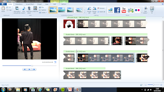 she was already so strong. We also did a rough dress rehearsal where Bela wore some of the outfits we had planned and used props we thought might go well, she was able to get used to these and we recorded it all to see if it looked appropriate. We then used Windows Movie Maker to cut the shots together and synch the clips to the 1991 audio which was helpful as this acted as a rough draft for us to look back at and learn from.
  Another very useful task was creating an animatic where I drew each shot out and labelled how long it would be, then we filmed each of the 57 drawings with a Sony FS100 and uploaded them to Adobe After Effects. Here we put them on the timeline in synch with the audio track and cut them to the appropriate time. This was very helpful as we were then able to see the extent of how many shots we actually needed, learning that we needed to cut to the beat and have as many shots as possible to work with.
Using Prezi was a really useful media technology, especially when researching similar artists to Bela. I was able to create three sections on each artist, comparing their music videos, digipaks and official websites that I researched on the Internet. This was a helpful reference to look back at and be inspired by to create Bela's products. I also looked on YouTube for these similar artist's videos, which allowed me to then find other useful videos and artists that were recommended on YouTube. However this was very time consuming and quite complex but I got the hang of it and by the end I thought the whole presentation looked really effective.
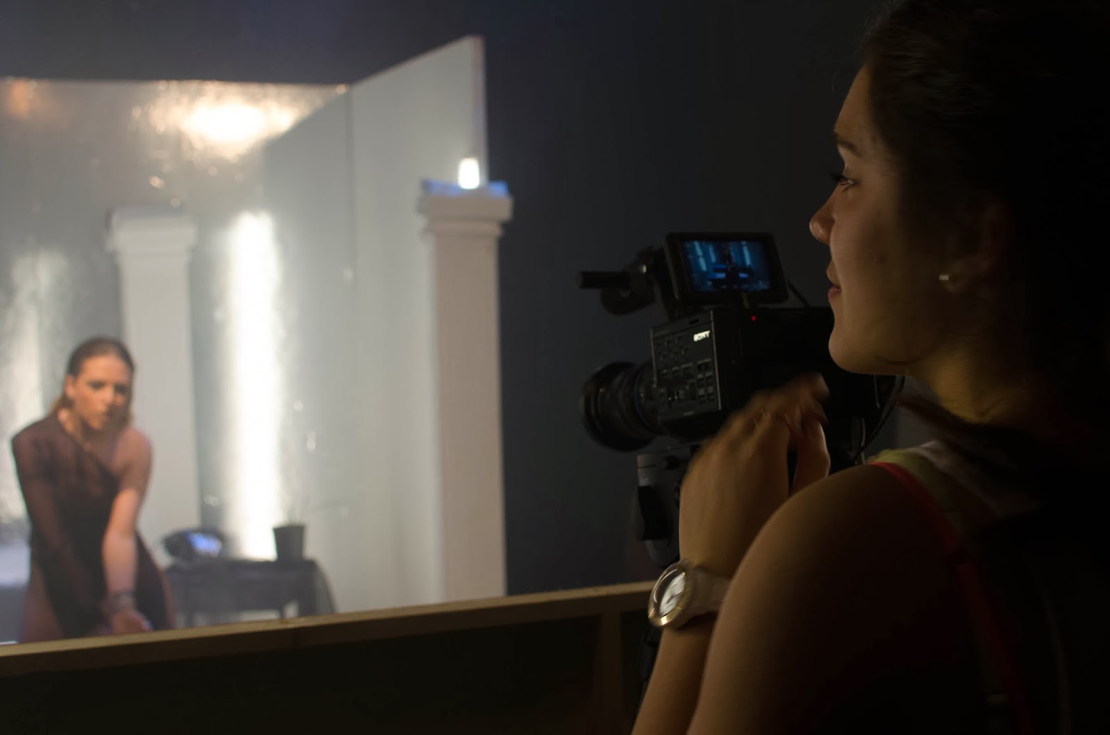.jpg) We used the Sony FS100 with an inbuilt 300 mm lens to shoot our actual music video, however we also used a variety of other lenses for other effects, including the Sony FS100 with a prime lens which gave us a better quality image. This made Bela look very flawless and was flattering, this was also achieved by using a 85 mm lens which had less depth of field and therefore gave a softer focus, smoothing any blemishes and flaws. Shooting with these lenses gave an amazing quality however we did have to change lens each time we wanted a close up as there was no zoom with these lenses which took time out of our shoot day.
We used the Sony FS100 with an inbuilt 300 mm lens to shoot our actual music video, however we also used a variety of other lenses for other effects, including the Sony FS100 with a prime lens which gave us a better quality image. This made Bela look very flawless and was flattering, this was also achieved by using a 85 mm lens which had less depth of field and therefore gave a softer focus, smoothing any blemishes and flaws. Shooting with these lenses gave an amazing quality however we did have to change lens each time we wanted a close up as there was no zoom with these lenses which took time out of our shoot day. 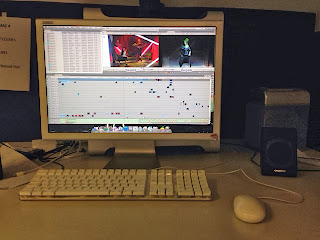 We then used Adobe Final Cut Pro to edit our footage, first putting all the shots into different folders, and then syncing every shot to the base track. As the song was very fast paced, lip synching all the shots first saved us a lot of time as we could then work constantly with all the shots instead of having to lip synch each shot every time we used it. After getting it all in order we looked at our footage, in order to avoid a flat image to the shots making it look very 3D we made some alterations to make the scenes more 3D and vivid, darkening and crushing blacks and brightening whites in the shots. We also made sure that the reds in the video stood out the most, complimenting her skin tone and sexuality.
To create a website for our artist Bela we used wix.com designing her a unique artist website from scratch. This was a complex task for me as I had never created a website before, however Wix was a very useful media technology as it was quite simple once I used it more, eventually getting the hang of it and creating a successful website: http://aliciahatfield.wix.com/officialbelawalter.
 We also used the Internet to look at other artist's websites such as Beyonce's and Iggy Azealia's which was very helpful as we then learned the conventions of this type of artist's website and were able to create a reliant website.
We also used Photoshop a lot to edit all the images that went on her website, airbrushing her skin and the background so the colours were all smooth and solid, giving her a flawless look.
I also experimented with Photoshop, using it in a more complex way, creating merchandise for Bela's website. I used the lasso tool to cut Bela's torso from an image of her and applied it to a T-shirt which I then scaled and edited to look realistic.

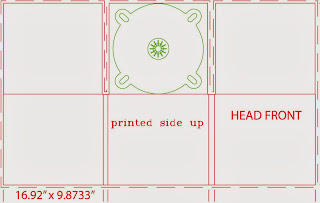 We also used Photoshop to create Bela's digipak, using an original digipak template as a base and building our own photos and text on to this. We also used the Internet to research similar artist's digipaks and album covers, discovering they all contained a lot of close ups of the artist and focused on her completely. Therefore I edited a lot of close ups of Bela, zooming in on her face, making sure the images all looked flattering and focused on her completely. We changed lots of little details in the images frequently, tweaking colours, images and fonts, however we then decided to use Photoshop to turn the images black and white. This was a common convention in digipaks as it is a very flattering colour scheme and makes the artist look very good, however once we had done this we felt the images looked a bit flat. Therefore we went back in with the Lasso Tool and cut around Bela's body, highlighting the background, we were then able to change the colour of the background, incorporating a tone of red into the otherwise black and white images. This then looked a lot more effective and not so dark and 2D. We chose to do this to represent her sexuality and continue with the black, white and red theme throughout her video and website, creating three cohesive products. Emphasising her sex appeal offers an additional side to Bela that appeals to young male fans. However it also appeals to females as they look up to Bela and admire her sexual attitude and confidence.
 We also used the Internet to look at other artist's websites such as Beyonce's and Iggy Azealia's which was very helpful as we then learned the conventions of this type of artist's website and were able to create a reliant website.
 We also used Photoshop a lot to edit all the images that went on her website, airbrushing her skin and the background so the colours were all smooth and solid, giving her a flawless look.
I also experimented with Photoshop, using it in a more complex way, creating merchandise for Bela's website. I used the lasso tool to cut Bela's torso from an image of her and applied it to a T-shirt which I then scaled and edited to look realistic.


 We also used Photoshop to create Bela's digipak, using an original digipak template as a base and building our own photos and text on to this. We also used the Internet to research similar artist's digipaks and album covers, discovering they all contained a lot of close ups of the artist and focused on her completely. Therefore I edited a lot of close ups of Bela, zooming in on her face, making sure the images all looked flattering and focused on her completely. We changed lots of little details in the images frequently, tweaking colours, images and fonts, however we then decided to use Photoshop to turn the images black and white. This was a common convention in digipaks as it is a very flattering colour scheme and makes the artist look very good, however once we had done this we felt the images looked a bit flat. Therefore we went back in with the Lasso Tool and cut around Bela's body, highlighting the background, we were then able to change the colour of the background, incorporating a tone of red into the otherwise black and white images. This then looked a lot more effective and not so dark and 2D. We chose to do this to represent her sexuality and continue with the black, white and red theme throughout her video and website, creating three cohesive products. Emphasising her sex appeal offers an additional side to Bela that appeals to young male fans. However it also appeals to females as they look up to Bela and admire her sexual attitude and confidence.


