Simon first created a digi-pak with the images taken from the extra photo shoot to see what it would look like to have an 'all attitude' image digi-pak, which did look professional and all the images fitted nicely together. However we felt we should also incorporate images from our original shoot in order for our products to look good together, this was also influenced by audience feedback we received, where they told us the products did not fit very well together as they were producing mixed messages of who Bela was.
Therefore we created a new digi-pak together mixing our photos from our original shoot from the music video day with photos from our most current shoot, in order to portray a mixture of elegance and class, with attitude and edge.
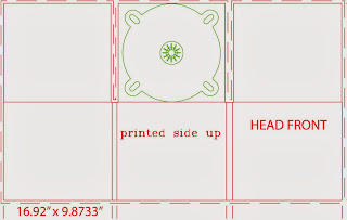
I found this template of a six image digipak which I uploaded onto Photoshop to work with so we had the correct scale and size for our photos.
We then started selecting images that we thought would be appropriate for each panel. I also edited some of the images to look better on the frame, for example for this image I used a black colour to fill in the floor to give a more glossy black look, removing the original matte black floor which did not look as nice. I then selected the part of the image I wanted to have, making sure it was a square so it would fit inside the template.
I then pressed 'Ctrl T' to scale the image to the appropriate size and fitted the images into each box.
We had a shuffle around of the images and changed quite a few as we went on. We then also added a bar code to the top right image as this was to be our back cover, we then also used the title that we took a screenshot from her website 'BELA WALTER' as we wanted to keep a consistent theme throughout her products. However we did not like having the black background of the font, but we were unsure how to remove it so scaled the title down and but it at the bottom, next to a Parent advisory label.
We finally came up with this selection of images for her digipak, but were still prepared to go back to it and work on it more as we felt it looked a little unfinished, and we also still needed to add in her songs and a few extra touched. However I do feel this was a good starting point as the images fitted a lot better together and portrayed a wider style and image of who Bela is as an artist.


No comments:
Post a Comment