This week I have been continuing to work on our website for Bela, trying out different fonts, colours and images. As we took so many pictures it has been difficult to cut it down to just a few that look good together and make everything coherent. However after trying out a few different images on the home page, along with a slide show, we decided we wanted to record some moving images of Bela and cut them together to play in a loop as our main page as this is a bit more exciting and shows her personality more, enticing the audience to look into more of the website. We will record these images on Monday and take some more pictures to pay around with for the album cover and digi-pak.
I have also been creating some merchandise on Photoshop, I found images of a black t-shirt which I used as a base for the garment. I then selected some pictures of Bela to use and using the magnetic cutting tool cut her body out of the image which I paced onto the top, I then scaled the image and edited it to look like it was printed onto the top. I have tried out a few different styles and will get some audience feedback to see which people like most.
 |
| Original T-shirt |
 |
| Using the magnetic cutting tool to cut out her upper body |
 |
| Copying the image onto the T-shirt and scaling it to an appropriate size for the T-shirt |
 |
| I then lowered the opacity to make the image more subtle and fade into the T-shirt to give a more stylistic, glamorous look. However I then decided it looked a bit odd as I cut her body off drastically at the torso so her body was awkwardly floating in the middle of the t-shirt. |
 |
Therefore I then went back and cut out her whole body, however the photo we took cut out the very bottom of her feet so I had to place the image right to the edge so it didn't look weird. I really like her strong stance in this image as it is empowering yet feminine and sexy which goes with the theme and style we are going for.
Here are the two black t-shirts that I will choose between, I am going to show an audience similar to her target audience and ask for their opinions and then choose which is better from their comments.
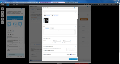
I then added a Merchandise page to the website and created a collection for her items, including a shopping bag and links to paypal with prices. I uploaded both t-shirts but will choose one to keep and create a few different items for her.
I priced the cost of her t-shirt at £18 because her audience will be willing to pay this amount online or at a concert as they want to feel connected with her and will see it as being linked to her.
However I will only create a few items for her merchandise page as she is an upcoming new artist who is not as established as say for example Beyoncé who has many items, but is more like Iggy Azealia who only has two items on her merchandise page.
|


No comments:
Post a Comment