Thursday, 12 December 2013

Working more on the website

We are constantly working on our products, improving little bits we feel should be changed in order to create the best appropriate products that we can. 
I looked back at our photos and decided to play around with them on Photoshop to make them look more edgy and exciting for our website backgrounds. 
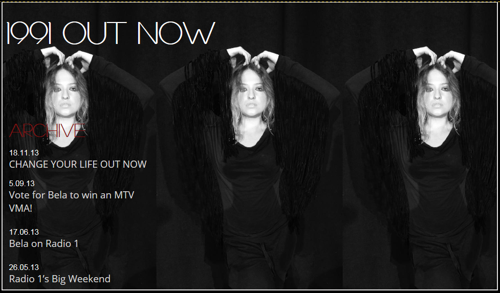
Here I have zoomed in on this close up of Bela's face, I then copied the image three times, rotating the image by 90° every time, creating a square image made up of them all. However the way the image cut her body off looked a bit unflattering and odd. 

Therefore I looked for a new image which I kept long but multiplied it, creating a mirrored effect which I thought was striking and effective. 

I then turned the image to black and white and made it the background image for Bela's 'News' page on her website which looked a lot more exciting and interesting than just one plain image. 

We then also added to our merchandise on our store, creating this t-shirt with a mix of her image and her name font. 

Developing the Digi-pak

I then went back to our digipak which I felt needed further development

We then decided to make the images black and white to make them fit better together and make the digipak flow. We then thought it was a bit plain so went back to the original image of the shoes and cut out the shoes which were a burgundy colour, we then layered these over the black and white image to make the colour pop against the otherwise black image. We also re added the Sony Music logo which had turned grey, making it red again. We then also added the songs we were putting on the album with a few lines of detail about each song for the inside cover, like we had seen in similar artist's digipaks. 

I then from the bottom right image cut the background out of the original colour photo and placed this behind the black and white image of Bela as the colours went with the theme. I then swapped around some of the images and added more text, the back cover having the songs in big font and the 1991 title on the front cover. 

However I then asked some members of my class to give me feedback on the digipak and they thought this particular image did not fit as well with the other images as it's background appeared a lot lighter than the others. Therefore on Photoshop I edited the image to make it darker, however it also made her too dark which did not look good. I then undid this and used the magnetic lasso tool to highlight the background only which I then made darker, leaving Bela's body the original lightness. The image then fitted in a lot better with the rest of the images and looked very effective and flattering as the album cover. 

I then also received feedback from piers that they felt it might be more effective to just have four really good images instead of having six ones which could swamp the digipak with so much going on. Therefore I cut the two images on the left off, leaving these four which I agree looks much more effective, showing quality not quantity! I then also got rid of the BELA WALTER and 1991 titles as the black background took away from the image. I tried to choose a similar font to the one we have used on her website however I could not find a similar one so selected this bold title.  

Sunday, 1 December 2013

Audience feedback

On Thursday Simon and I asked four students to view our products we have created so far in order to receive feedback and take constructive criticism to make our products better. I recorded their responses on my phone and then later combined the three sections and uploaded the feedback to my YouTube.

It was a very useful task as we showed them the digipak, then the website and then the music video to see if they could compare them and link the products together as we are trying to create a cohesive group of products portraying Bela's star image as an artist.

Our audience thought the digipak did not suit the rest of our work as we had used very different images and fonts making them look like two different brands. We have taken this advise on board and created a digipak that includes similar images and fonts to the website and has a flowing colour theme throughout.

They were more positive about the website as the felt Bela appeared the same here as she does in the video, showing who she is as an artist. However they thought the merchandise t-shirt with an image of Bela's face looked a bit young and wouldn't suit her actual target audience. I therefore have created a new T-shirt design with her name in the same font as on the website to make them look like the fit together.

This was a really useful process and we learned a lot from it, taking away some good advise so we can now improve our products. 


Friday, 29 November 2013

Futher development of the website


After receiving audience feedback from a few friends I went back to our merchandise as they said having an image of Bela on her t-shirt made it seem like she was appealing to a younger audience of around 13. I also wanted her other audiences to want her merchandise, appealing to an older, more mature audience of 18-30. Therefore I took a screenshot of the BELA WALTER title from her website which I then applied onto her black t-shirt.  
  

I then cut the two words apart so they would fit nicely on the top and scaled them to fit on well. I then used the eraser tool to rub the opaque black background away, leaving just the font in front of the t-shirt.

I think this t-shirt fits a lot better to her older audience and I could see her fans buying and wearing this t-shirt at her concert as a band tee, representing her. I like the simplicity of just her name as it is not as obvious, but a more subtle style of advertising her brand and music. 

Making our digipak

Simon first created a digi-pak with the images taken from the extra photo shoot to see what it would look like to have an 'all attitude' image digi-pak, which did look professional and all the images fitted nicely together. However we felt we should also incorporate images from our original shoot in order for our products to look good together, this was also influenced by audience feedback we received, where they told us the products did not fit very well together as they were producing mixed messages of who Bela was.

Therefore we created a new digi-pak together mixing our photos from our original shoot from the music video day with photos from our most current shoot, in order to portray a mixture of elegance and class, with attitude and edge.  
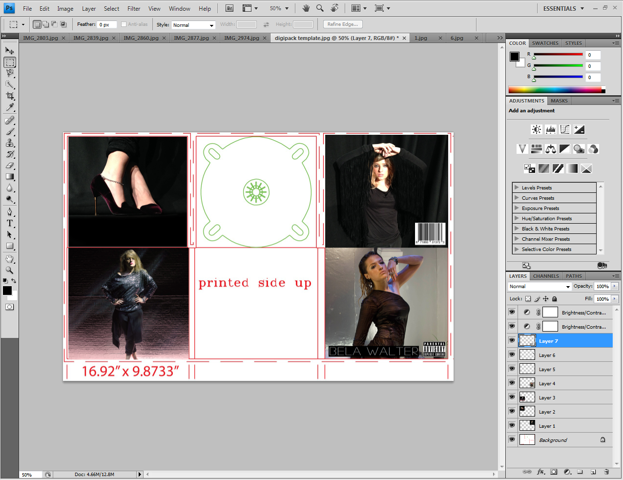
 I found this template of a six image digipak which I uploaded onto Photoshop to work with so we had the correct scale and size for our photos. 

 We then started selecting images that we thought would be appropriate for each panel. I also edited some of the images to look better on the frame, for example for this image I used a black colour to fill in the floor to give a more glossy black look, removing the original matte black floor which did not look as nice. I then selected the part of the image I wanted to have, making sure it was a square so it would fit inside the template. 

I then pressed 'Ctrl T' to scale the image to the appropriate size and fitted the images into each box. 

We had a shuffle around of the images and changed quite a few as we went on. We then also added a bar code to the top right image as this was to be our back cover, we then also used the title that we took a screenshot from her website 'BELA WALTER' as we wanted to keep a consistent theme throughout her products. However we did not like having the black background of the font, but we were unsure how to remove it so scaled the title down and but it at the bottom, next to a Parent advisory label.  

 We finally came up with this selection of images for her digipak, but were still prepared to go back to it and work on it more as we felt it looked a little unfinished, and we also still needed to add in her songs and a few extra touched. However I do feel this was a good starting point as the images fitted a lot better together and portrayed a wider style and image of who Bela is as an artist. 


Wednesday, 27 November 2013

Another photoshoot

 
After having a go at designing our website and digi-pak we reflected on our products and decided we needed to do another photo shoot of Bela against a black backdrop. We felt she needed to show more edge and attitude in her expression as all the images we already had from the filming day were quite soft and vulnerable. We therefore wanted to have a mix of our original pictures and add in a few new ones to show more attitude to Bela to fit with the music video.
Here are a selection of the pictures taken that we thought were good and could use with the other images and create a cohesive product. 


Friday, 22 November 2013

Working on the website

This week I have been continuing to work on our website for Bela, trying out different fonts, colours and images. As we took so many pictures it has been difficult to cut it down to just a few that look good together and make everything coherent. However after trying out a few different images on the home page, along with a slide show, we decided we wanted to record some moving images of Bela and cut them together to play in a loop as our main page as this is a bit more exciting and shows her personality more, enticing the audience to look into more of the website. We will record these images on Monday and take some more pictures to pay around with for the album cover and digi-pak.

I have also been creating some merchandise on Photoshop, I found images of a black t-shirt which I used as a base for the garment. I then selected some pictures of Bela to use and using the magnetic cutting tool cut her body out of the image which I paced onto the top, I then scaled the image and edited it to look like it was printed onto the top. I have tried out a few different styles and will get some audience feedback to see which people like most.

Original T-shirt

Using the magnetic cutting tool to cut out her upper body

Copying the image onto the T-shirt and scaling it to an appropriate size for the T-shirt

I then lowered the opacity to make the image more subtle and fade into the T-shirt to give a more stylistic, glamorous look. However I then decided it looked a bit odd as I cut her body off drastically at the torso so her body was awkwardly floating in the middle of the t-shirt.


Therefore I then went back and cut out her whole body, however the photo we took cut out the very bottom of her feet so I had to place the image right to the edge so it didn't look weird. I really like her strong stance in this image as it is empowering yet feminine and sexy which goes with the theme and style we are going for.

Here are the two black t-shirts that I will choose between, I am going to show an audience similar to her target audience and ask for their opinions and then choose which is better from their comments.

I then added a Merchandise page to the website and created a collection for her items, including a shopping bag and links to paypal with prices. I uploaded both t-shirts but will choose one to keep and create a few different items for her. 
 I priced the cost of her t-shirt at £18 because her audience will be willing to pay this amount online or at a concert as they want to feel connected with her and will see it as being linked to her.
However I will only create a few items for her merchandise page as she is an upcoming new artist who is not as established as say for example BeyoncĂ© who has many items, but is more like Iggy Azealia who only has two items on her merchandise page.